Friday 18 October 2013
influence for cover star
self assessment of codes and conventions


Thursday 17 October 2013
magazine infuluence

Friday 11 October 2013
self assessment of codes and conventions task
Thursday 10 October 2013
http://theproera.com/ This is the official website of 'Pro Era' I have put this as this is an up and coming rap group from new york ,the origin of rap, and the image the portray would be a group I would like to feature within my magazine as they're style of rap has an element of old school style(1980s and 1990s) .
Music Genre research-origin and style
When researching my chosen genre of music which is hip-hop, also know as rap,I found out that it originated from around the 1970's in New York city(mostly the Bronx) when block parties became more popular and was particularly among African American youth.Rapping is a vocal style in which the artists speaks lyrically, in rhyme and verse, normally to a synthesized beat or instrumental.
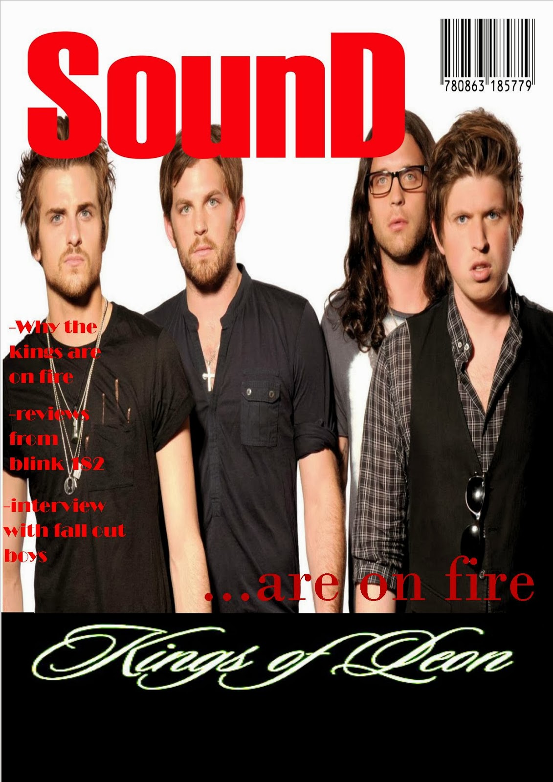
codes and conventions task-sound

codes and conventions task-pitch

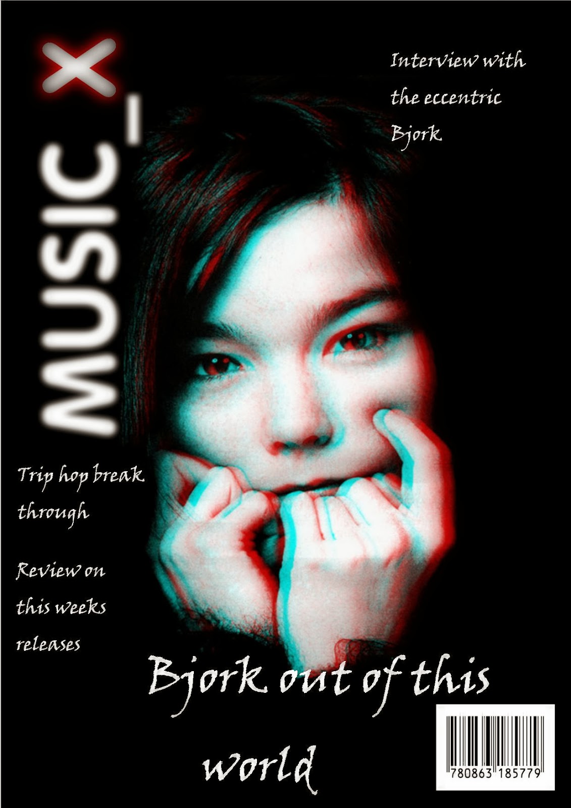
codes and conventions task-music_x

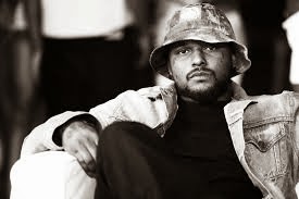
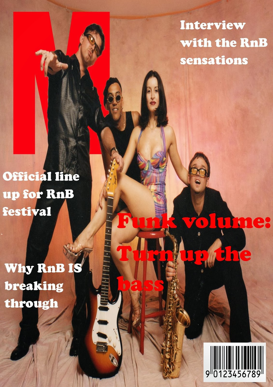
codes and conventions task-M

codes and conventions task-M drake
I used the white font as it stand it on comparison to the black t-shirt, the cover lines stand out in black writing on the light background.The typography gives off an urban and professional feel in relation to the cover star. The cover is not over complicated as it will draw attention away from the main image.
Friday 4 October 2013

Subscribe to:
Posts (Atom)