Saturday 14 December 2013

Page plus project

Front cover and contents page


Double page spread
When using page plus for the first time to create a front cover, contents page and a double page spread I experimented and explored with the software as much as I could to make full use of the features. I feel that the software Helps to make the magazine look more professional and I think in my case that my double page spread looks much better compared to the one I created on Microsoft publisher and I also have come to prefer this software in comparison to Microsoft publisher and paint.net.

Friday 6 December 2013

questionnaire analysis

In order to find out what my chosen target audience for my magazine, which is  males ranged from around 15 to 21. From this questionnaire I have discovered what questions my target audience find have a lot of important and what questions they feel have low importance in the magazine.

Thursday 5 December 2013

front cover for cover star (ideas)

 
Now that I have identified the character for my cover star I will need to find the best way to get this across through the photography for the front cover.
This Is close up shot which can show the attitude of the artist and the gold chain represents the current success of the artists and how he is in the spotlight currently.

The mid shot allows room for hand gesture  in the shot and allows the artist to express themselves more and in this picture it allows him to show off more expensive assets pronouncing his importance.
 
 
The use of the long shot makes the artist seem important from showing the whole body figure and also in this case allows the artist to have more prominence on the page even that its not in a close shot.
 
 
Out of these options I will have to choose One which I think will represent my artist best and show off my artists personality and attitude.


Wednesday 4 December 2013

Artiste Identity

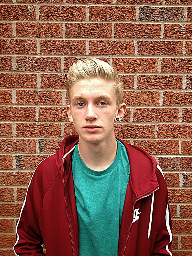
His name is Jason Ivy but stage name is J indigo, in this is what he is none as most. He is 19 years old and is born in Ireland, Dublin but moved to america, new York Brooklyn when he was 5 years old and on the streets of Brooklyn is where he learnt to rap and began to make his hobby into a profession. He started his rap career by posting freestyles on YouTube and by this got noticed by a label and signed for them this label record is called rap Region. With this label made his first album which is called Guinness punch and got the inspiration for this album from his Irish background and his upbringing in new York.
Track list for album:

1. Four leaf clover
2.New York dreams
3.green team
4. Mashed Potatoes
4.shamrock shame
5.sky scraper city
6.state of liberty
7.Lonely yellow taxi
8.Time in the square

Jason wants to tour all around USA but also go to the UK also to perform this is the reasons already been mentioned.
He likes to inspire people with his music, people who have the same goal as him and also sushi food strangely. But he doesn't like racism,negativity and 'copycats'.
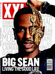
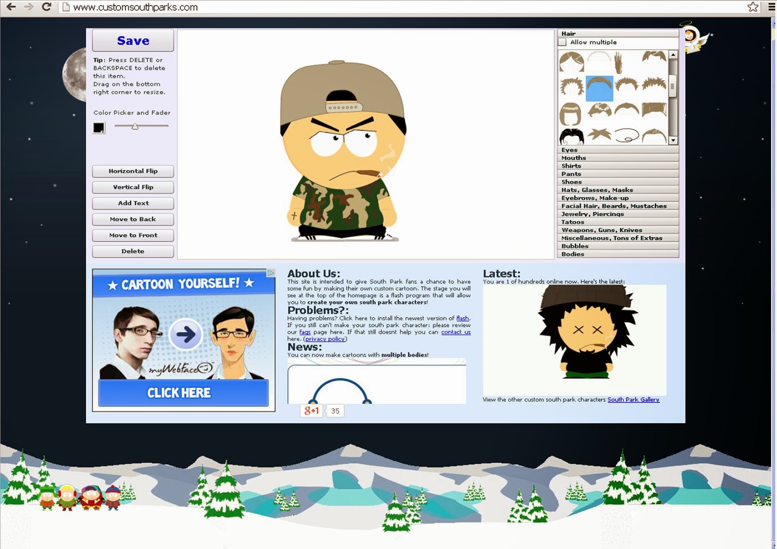
to put across his image I used this website that lets me create a character, this is how Jason will dress with a sort of typical rapper look for example caps and trainers.
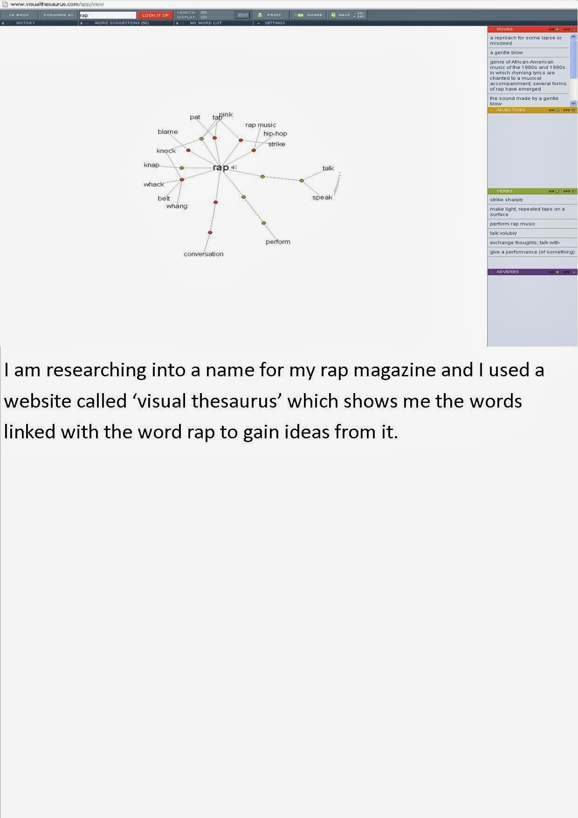
Friday 22 November 2013

double page spread practice

The picture takes up all of one page with the artists name which gives them a sense of importance and focus in the double page spread. I think that the picture compliments the layout and emphasises the importance of the artist once again through the use of a close up. A technique for a double page spread that i also used is called a pull out quote which attracts the reader into reading the whole article.I have used a very basic colour scheme of white, navy blue and dark grey as I felt that these colours complimented each other well. On the right side of the double page spread I used the dark grey background as in most double page spreads that I have researched are white, by changing the colour of the background I feel it will adapt an element of my own ideas.

Logo Ideas for mgazine

When drafting logo ideas I had to take in to consideration the content of text, the style of the text and also the colour. I feel that I have found the right name for my magazine logo hence why I experimented only with the styles and colour. I particularly like the bottom left logo as I feel the typography on this is suited. I don't however like the top right logo as I feel that it doesn't at all go and is the wrong combination of the three components that a logo consists of.

Thursday 21 November 2013

double page spread from inspired magazine (XXL)

By analyzing this double page spread I was able to gain an understanding of the main features and basic layout which I can later put into practice so that I will be able to create a final good double page spread.

magazine front cover- experimental practice

As it is still early enough for me to experiment with elements that consist on a front cover of a magazine and the layout that is also normally included. I decided to try a different music magazine genre so that I can bring in different features, in this case a DJ magazine, to put into my final magazine cover. Currently I am working with a white background however I would like to try and use original background from photography as I feel this could make the cover look less plain. However the advantages of as white background is it makes the cover star and the cover lines stand out. I believe that to improve I will need to find a way so that the cover lines seem more relevant on the page this can maybe done by getting the correct color scheme in place so that everything on the page links, this will be something I will look to include the next time I practice a front cover to see how well it works.

Friday 8 November 2013

Wednesday 6 November 2013

Magazine practise

 
When doing this magazine front cover I used typical codes and conventions such as date line, price , bar code and masthead that must essentially be used for a magazine and the rest are additional codes and conventions that make the difference between a high and low quality magazine.The main cover line and cover lines must use the right typography in order to match the magazine genre or the cover star. Things like who the cover star is and pugs add additional attraction to the magazine and will increase purchases if the audience is appealed to. Weather or not the masthead is in front or behind the cover star varies dependent on the cover star image as this one is in front to show the dominance also through the use of direct address of the cover star (eye contact).

Tuesday 5 November 2013

Research and influencial magzines

'XXL' magazine is one of the largest magazines that focus purely on rap music so I will asses and analyse a lot of the layout and features that they include so that I can make decisions to what I would like to include in my magazine as it has a great impact.
 The magazine has an eye catching and recognisable masthead which is important as it establishes the magazine and is the main thing used for advertising. Other key codes and conventions are used like a bar code, main cover line and cover lines and the right balance is found on the front cover so that cover star is clear but also that no negative space is left and that the magazine are not being pushed out of focus also.
In different additions of XXL magazine the masthead is either behind or in front of the cover star and this will also be a key decision I will have to make for my final magazine.

cover star ideas

I've been planning and coming up with ideas for a cover star and one idea that I particularly like is 'breezer' he is called this as his friends know him to be 'chilled' and his fans see him a real laid back 'cool' character. He wears a lot of caps and street wear like most other rappers. He is seen as an up and coming rap artist with his unique style and recent popularity which will see him recognised more and featured in magazines such as mine.

Friday 18 October 2013

influence for cover star

An artist like SchoolBoy Q would be an influence to my cover star.The way he dresses for example hats and street wear would be something I would like my cover star to emulate.I want my cover star to reflect their music through the way they look so mis en scene plays a big part when shooting a cover star as the costume needs to be done correctly in order for this to work.

self assessment of codes and conventions


 I have justified my decisions on my blog as i explained why I opted to keep the covers simple. However I feel that I could of enhanced these by putting more on to the covers as a lot of free space was left which could be seen as negative so when doing a task like this again or when creating my magazine i have to find the fine balance between the amount of cover lines I include into my blog and also space I leave so that the cover star is shown clearly.In the Future I will use this task for layout and organisation influence and for photography and blocking.


Thursday 17 October 2013

magazine infuluence

XXL is a Hip hop magazine it has a simple and bold mast head and has a continuous colour scheme of red and white but this changes when there are special editions. They do annual things inside the magazine such as 'top 10 freshman of the year' this is influential as I feel I could do something like this in my magazine as it gives an extra aspect to the content as the reader would not just want to read interviews and reviews.

Friday 11 October 2013

self assessment of codes and conventions task

looking back at this task i think that i didn't make the cover lines bold enough i made this mistake by trying not to make the cover lines too outstanding as this would take attention away from the cover star and main cover line however in this process i didn't make the cover lines bold enough which made them seem insignificant on the cover.I also think that there is too much free space on the cover also.

Thursday 10 October 2013

http://theproera.com/ This is the official website of 'Pro Era' I have put this as this is an up and coming rap group from new york ,the origin of rap, and the image the portray would be a group I would like to feature within my magazine as they're style of rap has an element of old school style(1980s and 1990s) .

Music Genre research-origin and style

When researching my chosen genre of music which is hip-hop, also know as rap,I found out that it originated from around the 1970's in New York city(mostly the Bronx) when block parties became more popular and was particularly among African American youth.Rapping is  a vocal style in which the artists speaks lyrically, in rhyme and verse, normally to a synthesized beat or instrumental.

codes and conventions task-sound

I used a Pun from kings of leon's hit song to identify their success.The typography matched the cover stars and the font color is used to stand out.The cover lines are to the left of the page as it makes them the main subject and doesn't take attention away from them.

codes and conventions task-pitch

The typography choose matched the 'zombie' like cover star e.g the red writing the color of blood which we associate with zombies and the dark type stage character he takes on in his music.Also the word choose such as 'grave' are also in association to the music genre and cover star.

codes and conventions task-music_x

The typography choose was revolved around the cover star as i felt the distorted writing matched the individuality of this cover star.The black and white contrast is very effective as it makes the magazine most simple and effective.

codes and conventions task-M

I choose this name for the group as I think that they portray a 'funky' look and this word is normal associated with the 80's and i feel this is the sort of image they come across as in a modernism fashion. I used the free space in the picture to put the cover line relating to the cover stars as I don't want them to take over the magazine.The choose for text color was so it stood out and the font matches the magazine type as it would not be match if a font like 'times new roman' was used as it is too formal for a magazine of this type

codes and conventions task-M drake

I used the white font as it stand it on comparison to the black t-shirt, the cover lines stand out in black writing on the light background.The typography gives off an urban and professional feel in relation to the cover star. The cover is not over complicated as it will draw attention away from the main image.

Friday 20 September 2013

Wednesday 18 September 2013

Music Genre for magazine

The genre of music I want to do for my magazine is Rap. My target audience is people who have an interest in Rap and especially targeting teenage males as this genre of music appeals most to this audience.The style I want is mainly dark colors as it relates to the to the niche audience and the dark color scheme also relates to the nature of the genre of music i have chosen.

My magazine draft cover


Friday 13 September 2013


i like how their genre of music is revealed through the cover.The picture of the group is the background and text is overlapped over it however the picture is still the main focus.The music magazine have a basic layout of  where the logo and other things are placed this shows consistency and gives the company the professional look they want to portray.The fact that the edition is on the arctic monkeys overshadows the magazine because of how know and popular the group are and also they don't even say who it is the text overlapped over the picture is 'A M' the group is that big that they don't need to be named.The colors work well as they are quite soft e.g the blue of the sky and the white text so they are not the main focus also on top of the this the dark clothing of the group makes them stand out on there soft colored surroundings.

Thursday 12 September 2013


                                                                 http://www.theweeknd.com/
My name is Jae Plummer and i am doing As media